



Quiz Bingo World Tour
A trivia game played on a bingo card, and my first mobile game. As Design Lead and UI Designer, I led its visual and UI design from the early prototype through its release on Android and iOS, 2024 to 2026.
Give it a spin
Play the core loop
Rebuilt from the final Figma screens and the original Unity assets. Game rules by the product team, low-fidelity wireframes by our PM. The visual concept, high-fidelity UI, and interactive prototypes are mine.
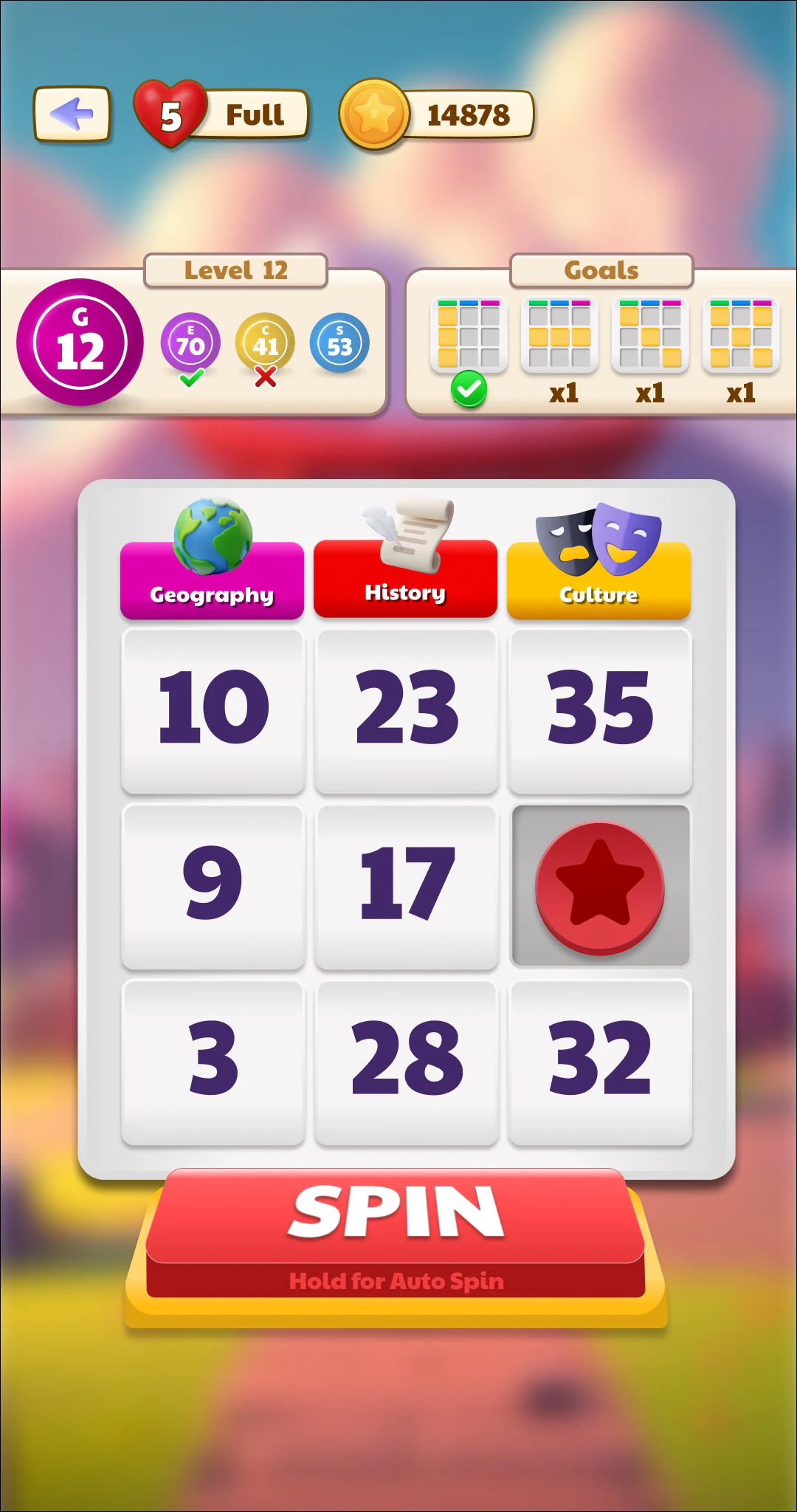
Tap Spin to get a Question Ball!


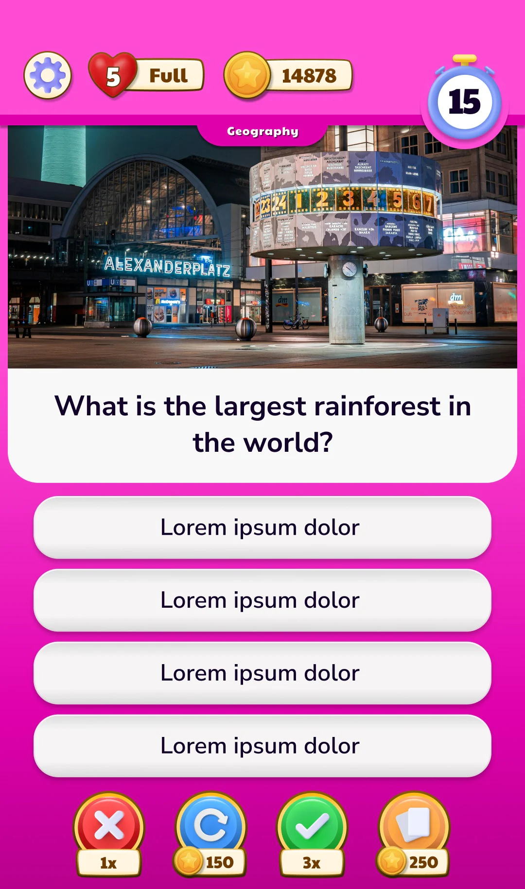
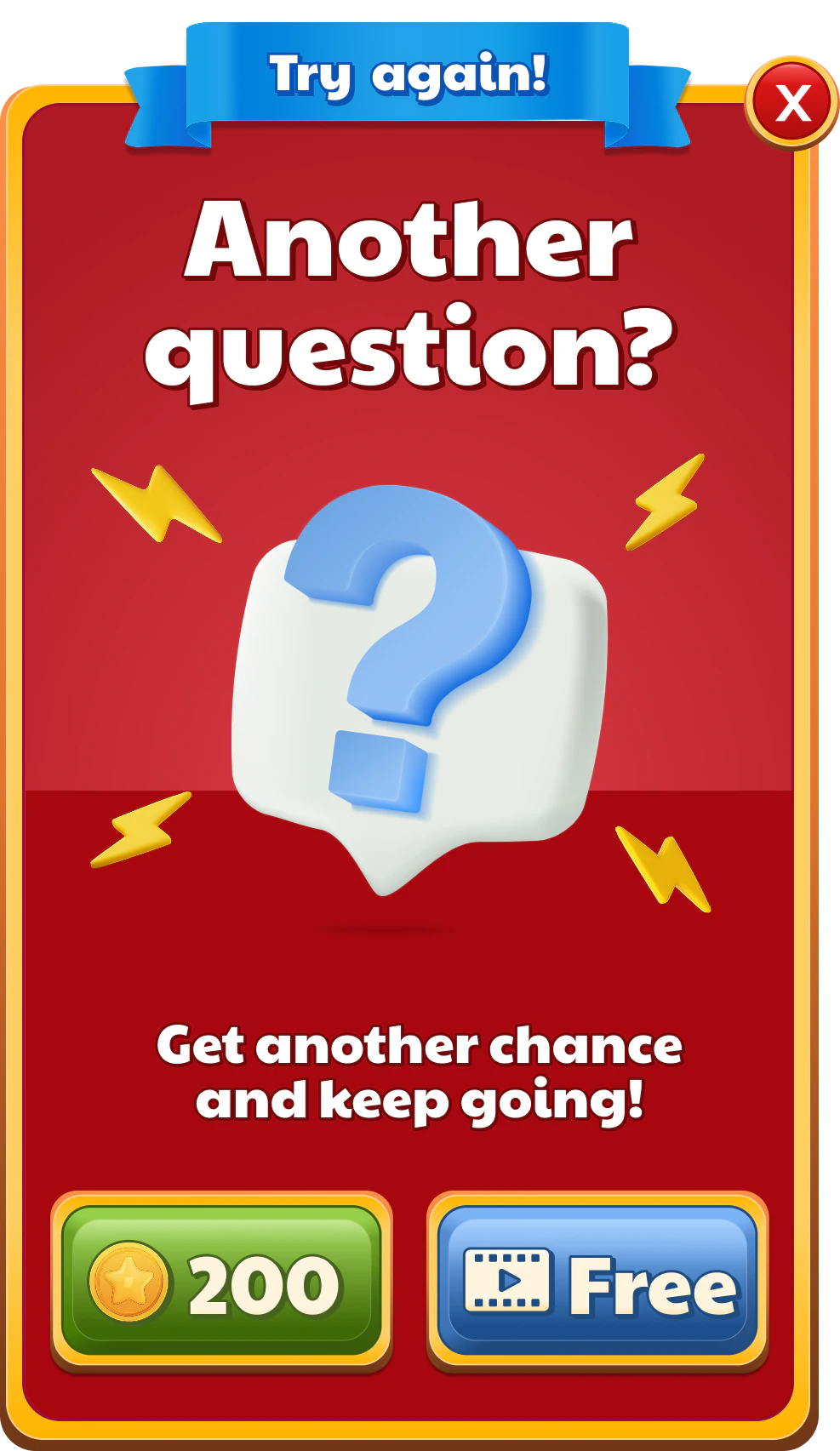
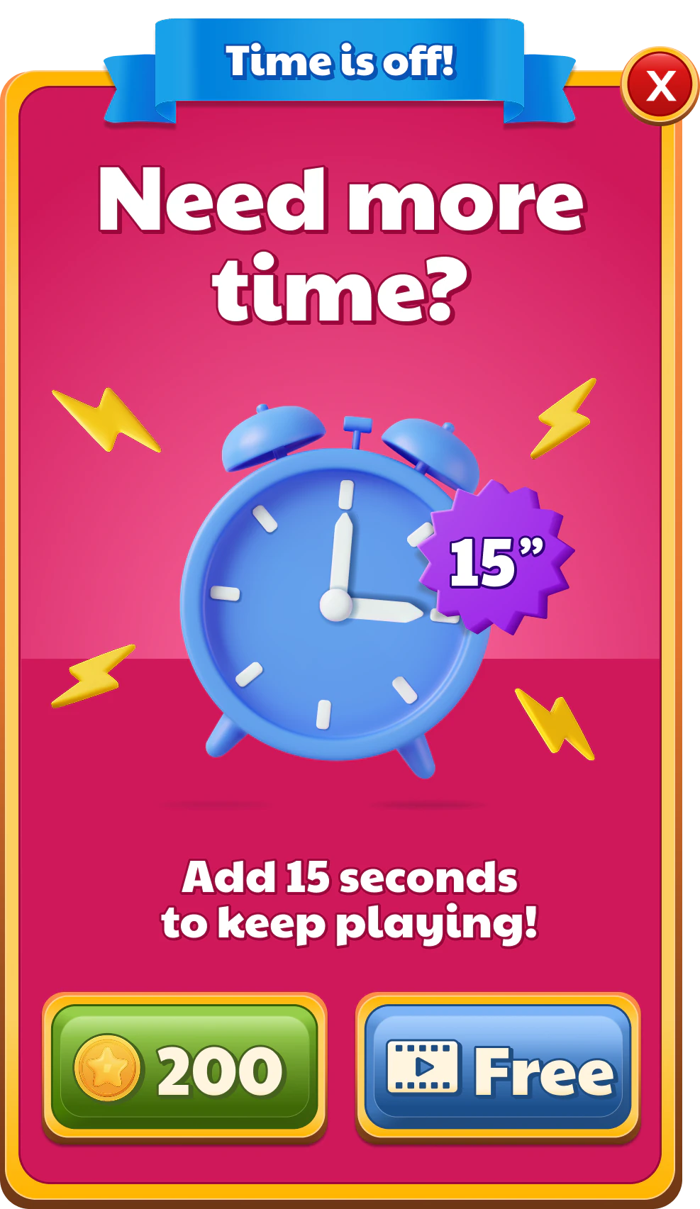



That’s the loop
Spin, answer, daub, Bingo. Everything else in the game grew around these few seconds.
Where you are
Demo setup: the draw is fixed to Geography 9, and 10 and 3 start daubed so one right answer completes the vertical goal.
02 / Concept & validation
Rules on paper, a game on screen
The project started as Quiz Arena, a quiz-meets-bingo concept. The product team defined the mechanics and the first five minutes in a game design document, and our PM turned them into low-fidelity wireframes. The priority was speed: a playable prototype to validate the gameplay.
I translated the wireframes into high-fidelity UI and an interactive Figma prototype of the FTUE. The document introduces one mechanic at a time (the question ball, the card, stars, the End button, lives, the timer), so each screen had to make one idea clear: a tip on Spin, a 3×3 card that reads at a glance, and a first Bingo within reach.
The first challenge wasn’t building a visual world. It was making the game playable and understandable, so a full identity was deliberately left for later. Once the mechanics took shape, the next challenge was giving them one.
The first five minutes, June 2024.


1 · SpinThe tip sits on the button it describes.


2 · QuestionOne photo, one question, four large answers.


3 · Reward“You got a Star” becomes a full-screen moment.


4 · End of levelRules arrive one at a time, when they matter.
03 / Designing in stages
From a prototype to a world
From there, the project moved toward release in three stages, often with the team working on two at once. Each stage had a different job, and the game’s identity only arrived in the second one.
Stages of development, not store release dates. Player names and ad slots are placeholders from the original design files.

04 / Soft launch identity
Every level is a stop on a trip
Giving the mechanics an identity was the Soft Launch’s job. The Quiz Arena concept grew into Quiz Bingo World Tour, and I developed its World Tour theme, the logo, and the visual direction. Cities group the levels, each with its own landmark, and every trivia category owns one color and one object, so you know where you are before you read a word.
The chapter art and unlock popups below are Official Release versions, where the same system kept growing.
Logo, World Tour theme, and visual direction by me.
Chapter art · Official ReleaseNine cities, one landmark each


Unlock popups · Official ReleaseNew chapters and new categories


One landmark, three steps
I explored the Amsterdam windmill with AI, first as a scene and then as a 3D-style icon, before it became the final icon in the New Chapter popup.

1 · Exploration
AI scene, Midjourney

2 · Exploration
AI icon, Midjourney

3 · Official Release
Final 3D icon, used in the New Chapter popup
05 / From designing to directing
From storyboard to screen
In the early stages, I created the motion references myself. While we prepared the Official Release, I advocated bringing a Motion/3D Designer onto the team, and my role shifted to art direction: storyboards to agree on each moment, interactive references for timing, and feedback and visual guidance while the specialist built the final 3D and motion.
My early motion explorations
Motion references I made myself: flat and quick, to show what happens and when.
Four beats of the same loop, as motion references for the Soft Launch. Note the small ball machine in the corner of the HUD. It comes back in part 3.
My direction and handoff
Figma storyboards and interactive references, built for our developer and for the specialist.
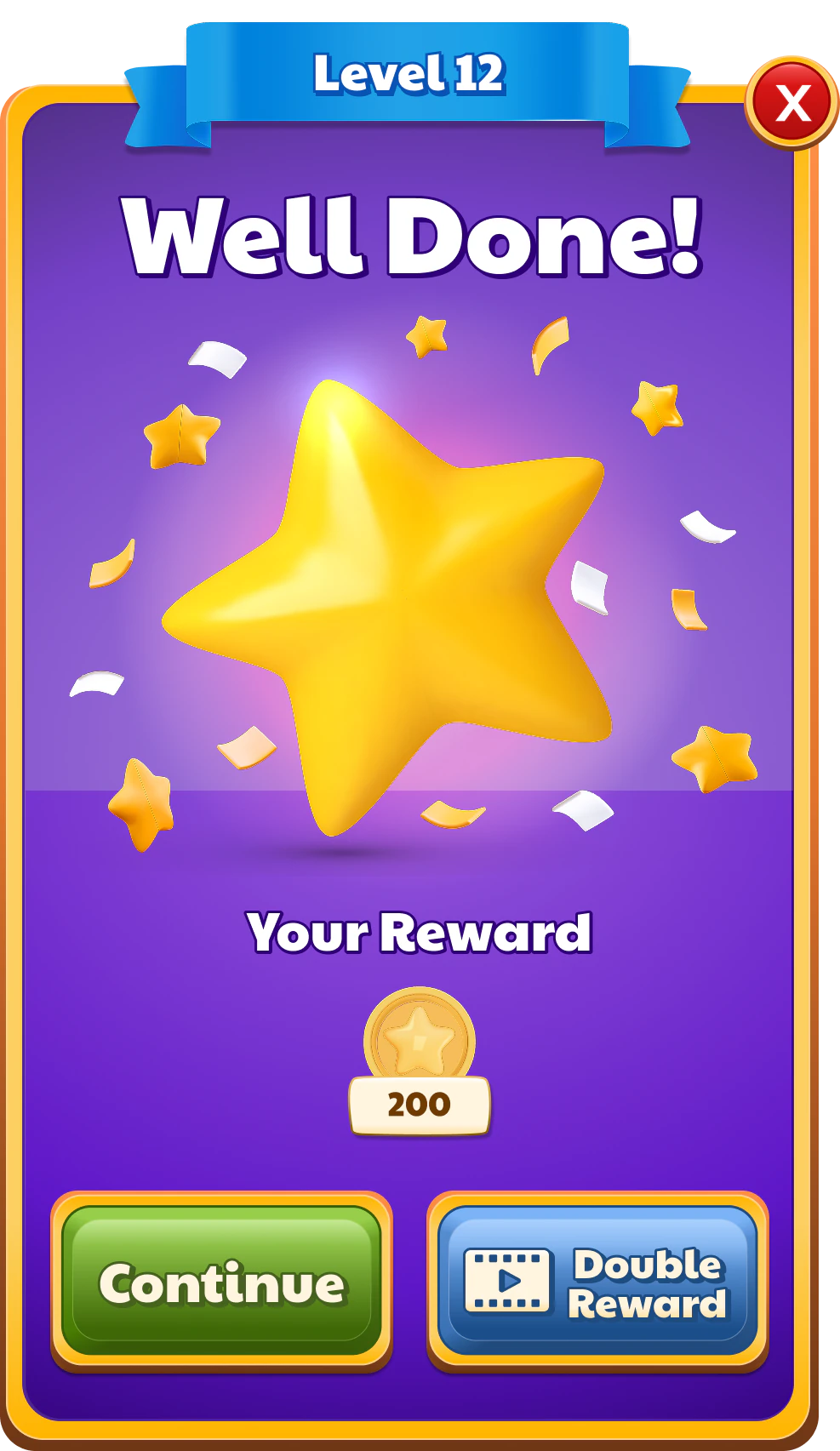
Level Complete · Figma storyboard
Pick a frame or drag the bar. The interactive reference jumps to the same moment.
Well Done · Figma interactive reference
Motion/3D execution
Final 3D and motion by our Motion/3D Designer, shared as approval previews under my art direction.
By me Figma prototype
Motion/3D Designer Matchmaking
Matchmaking. My prototype set the diagonal split, the layout, and the order of the reveal. The preview adds the 3D bolt, the avatars, and the motion.
Motion/3D Designer Ball machine
Approval previews were shared for sign-off and aren’t necessarily the shipped versions.
06 / Growing the UI system
The same pieces, many features
As the game grew, the same kit kept stretching. Rewards, duels, profiles, feedback, and a shop each reused the same UI components (the popup frame, the ribbon header, the chunky buttons, and one 3D object as the hero), and none of them needed a new visual language.
07 / Working with Unity
Built to be built
Designing for Unity meant designing for implementation. I prepared every screen so our Unity developer could build it without guessing, then answered questions as implementation went along. Each one left Figma with:
- an interactive Figma prototype of the flow
- a high-fidelity reference screen and a type spec
- every layer as a 4× UI asset export
- a motion reference for anything that moves
Edit Profile, broken into 4× exports
The Edit Profile popup from the flow above, and the UI assets I exported for it, from back to front.
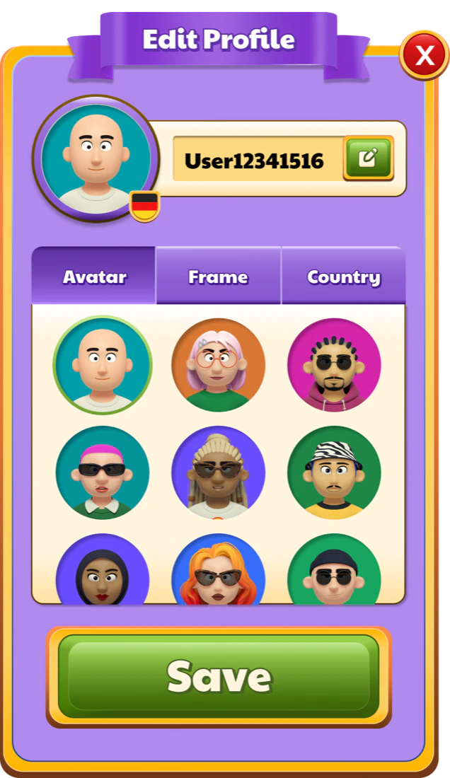

BackgroundPopUp_EditProfile_Background@4x.png

RibbonPopUp_Ribbon_Purple@4x.png

Avatar frameProfileScreen_Frame_Purple@4x.png
AvatarProfileScreen_Avatar_1@4x.png

Name fieldPopUp_EditProfile_AvatarName_Background@4x.png

TabPopUp_EditProfile_Tab_Left_Pressed@4x.png

Options panelPopUp_EditProfile_Options_Background@4x.png

Save buttonPopUp_EditProfile_Save_Button@4x.png

CloseCloseButton@4x.png
Text, flags, and avatars are kept separate from the background exports.

1080 × 2048Base phone

1080 × 2340Taller phone

1080 × 2560Tallest phone

1536 × 2048Tablet
One layout, multiple screen sizes
I exported the same Home for three phone heights and a tablet. The top bar and the navigation stay pinned to the edges, while the landmark, the reward stickers, and the Level button shift to use the space between them. On tablet, the stickers spread wider around a larger landmark, so the hierarchy reads the same on every screen.
08 / What I learned
My first mobile game
Feedback is the game
Quiz Bingo showed me how much of a game’s experience lives in its feedback. Progression, rewards, and celebrations are what make a short session feel worth repeating, so a star landing or a chest opening deserves the same care as any screen.
Designing with the engine in mind
A game engine changes when you think about the details. States, assets, and motion have to be considered while a screen is being designed, not after, and technical limits are far easier to design with early than to work around late.
Knowing when to bring in expertise
My first mobile game taught me that leading design doesn’t mean executing every part of it. I could create motion references and communicate how an interaction should feel, but I also recognized where my skills had limits. Advocating for a Motion/3D Designer gave the game the expertise it needed and challenged me to grow into art direction: setting a vision, communicating it clearly, and refining the result together.